Inrise
The development of the brand guideline became a natural continuation of building a cohesive visual identity for the auto insurance company and an important step in systematizing the brand. The document established the key principles for using the corporate style and ensured a consistent visual standard across all audience touchpoints.
Брифинг
The ultimate goal of developing the identity and brand guidelines was to create a brand for the auto insurance company that reflects its core values — reliability, protection, and forward movement. The visual system was designed to convey the confidence and stability that clients expect from an insurance partner.
Asakabank
Brand Guidelines
Brand Design Brand Guidelines
Бизнес цель
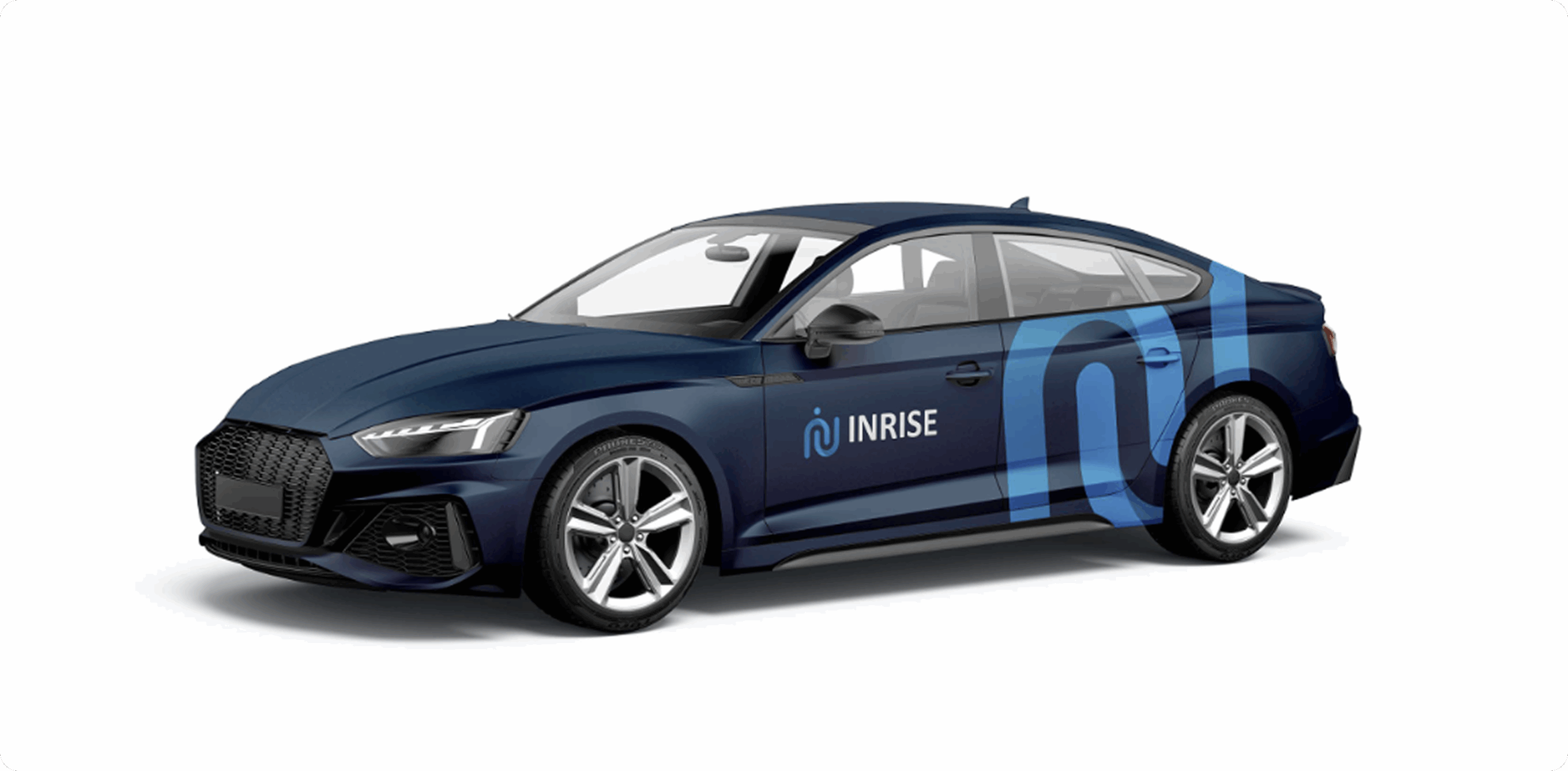
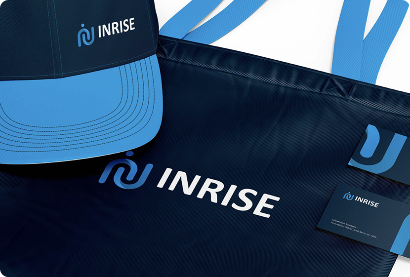
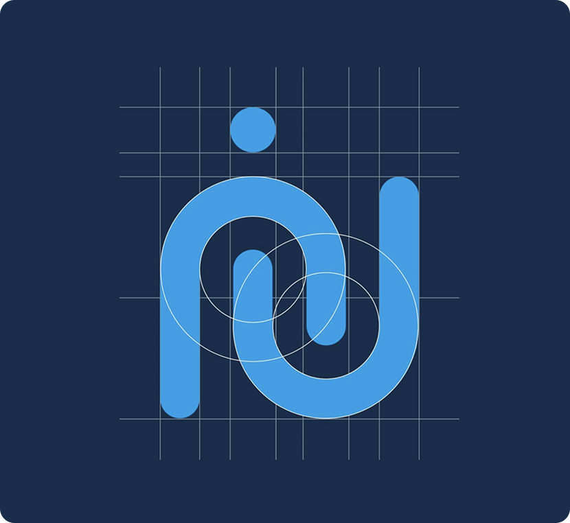
The new logo of the auto insurance company combines several key ideas that reflect the brand’s specifics and values. At the core of the mark is a combination of the Latin letters “i”, “n”, “r”, and “s”, forming a cohesive geometric composition and referencing the company’s name.The clear structure and precise lines emphasize systematization, reliability, and a professional approach.
Описание
продукта
The rebranding of the auto insurance company represents a comprehensive brand renewal reflecting the company’s growth and its modern approach to insurance services. The project included not only the creation of a new visual identity but also a rethinking of the brand’s values, positioning, and role in clients’ lives.The new logo, built on the combination of the Latin letters “i”, “n”, “r”, and “s”, incorporates symbolism of protection, people, and upward movement. The clear construction of the mark emphasizes reliability and stability, while the dynamic growth vector reflects the company’s commitment to development and continuous service improvement.
Процесс
разработки
A market analysis of the auto insurance sector and the competitive landscape was conducted. A clear brand positioning was established, and its role for clients was defined. A strategic foundation was developed, reflecting the values of reliability, protection, and growth.
A unique mark was created based on the Latin letters “i”, “n”, “r”, and “s.” The composition incorporates symbols of a person and upward movement as a metaphor for growth. The logo combines geometric precision, stability, and modern dynamism.
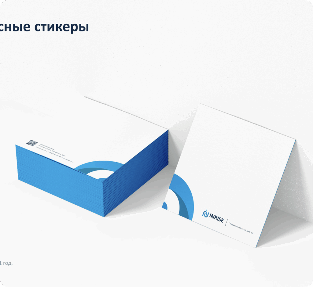
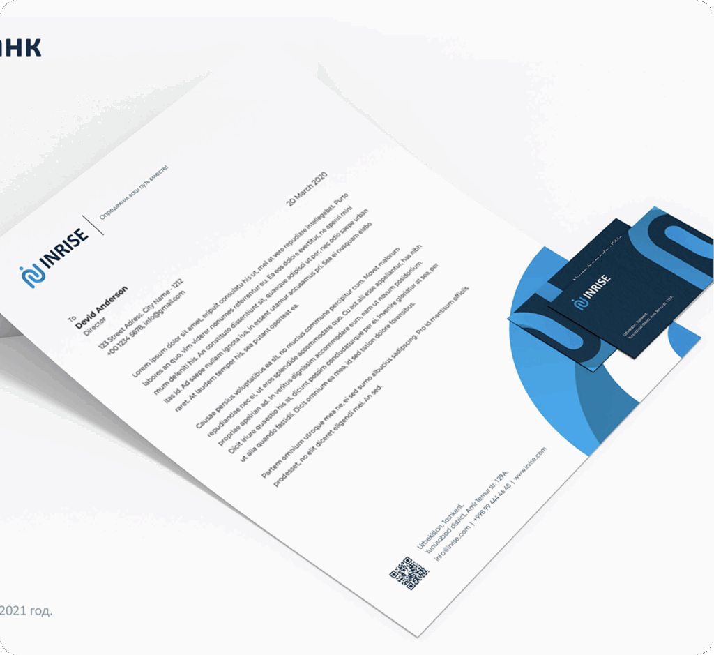
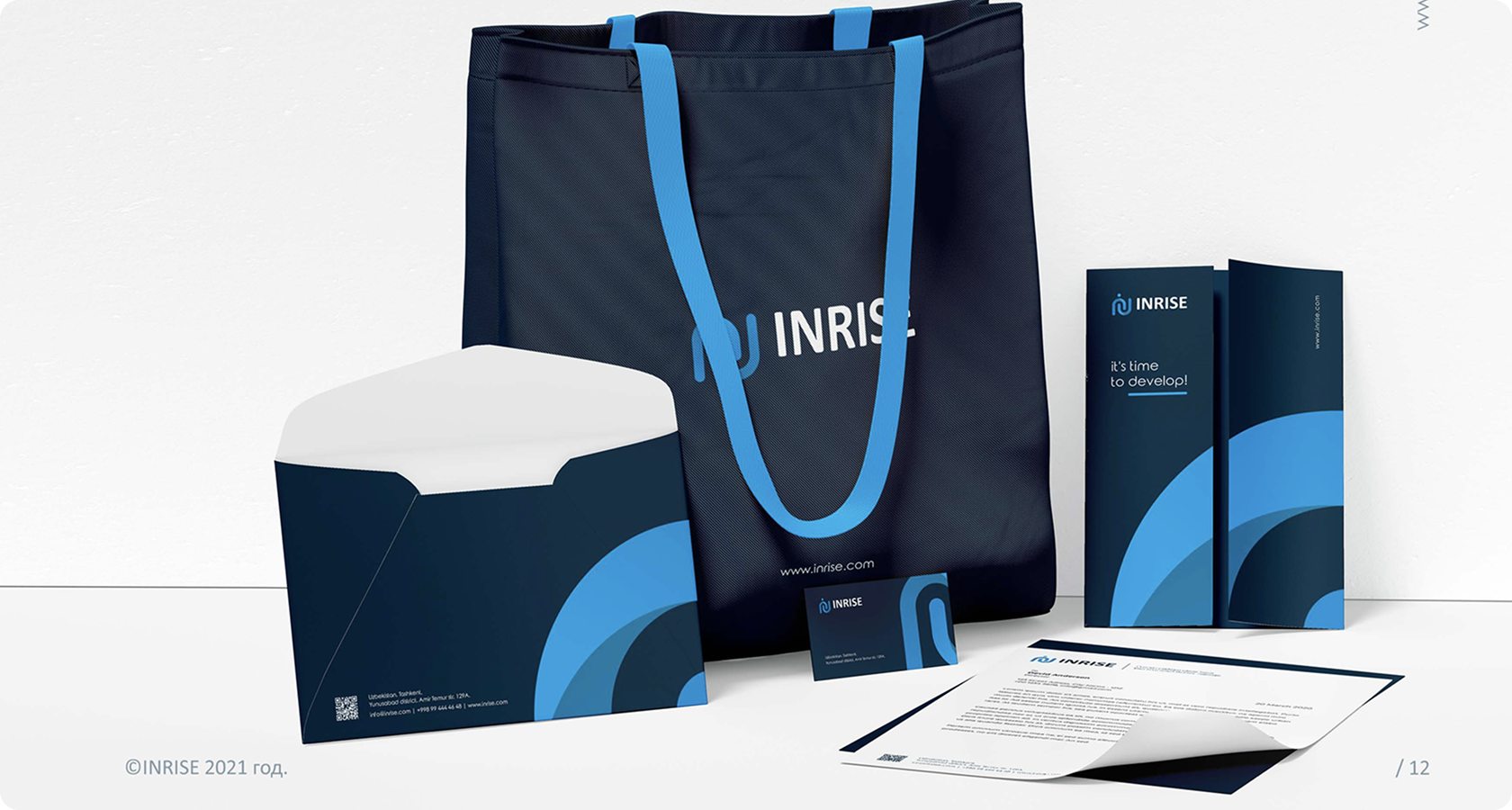
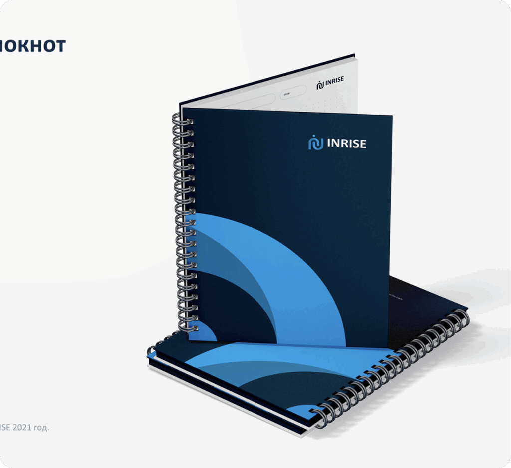
A system of branded assets was developed for both offline and digital environments. The application of the visual identity was carefully designed across documentation, advertising, and corporate materials. A unified visual style was established for all audience touchpoints.
The tone of communication was defined as confident, clear, and customer-oriented. Key messages about safety, trust, and service were developed. A consistent system of interaction with clients and partners was established.