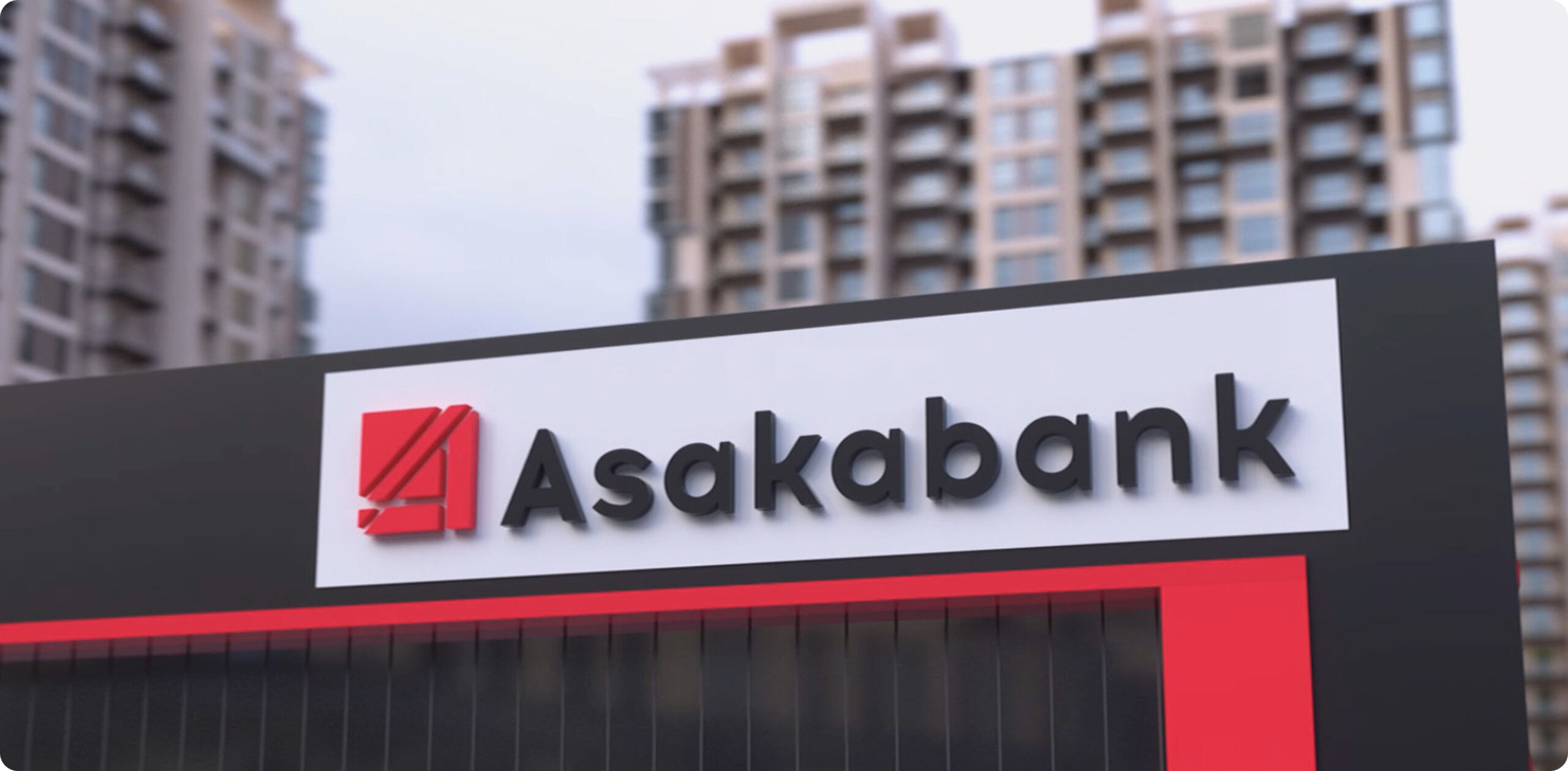
Asakabank
Rebranding of Asaka Bank was a complex and exciting project. Through the joint efforts of our team and the specialists of Asaka Bank, a multi-stage process was developed, covering all aspects of the bank’s operations. This was not just a change of the logo or the bank’s name, nor only updates to the identity and corporate style.
Брифинг
The ultimate goal of the rebranding was to create a brand that reflects the bank’s history, its values, and principles. A brand that would take its достойное place in the lives of the bank’s clients, partners, and employees, and transform their perception of the bank.
Asakabank
Rebranding
Brand Design Branding,Rebranding
Бизнес цель
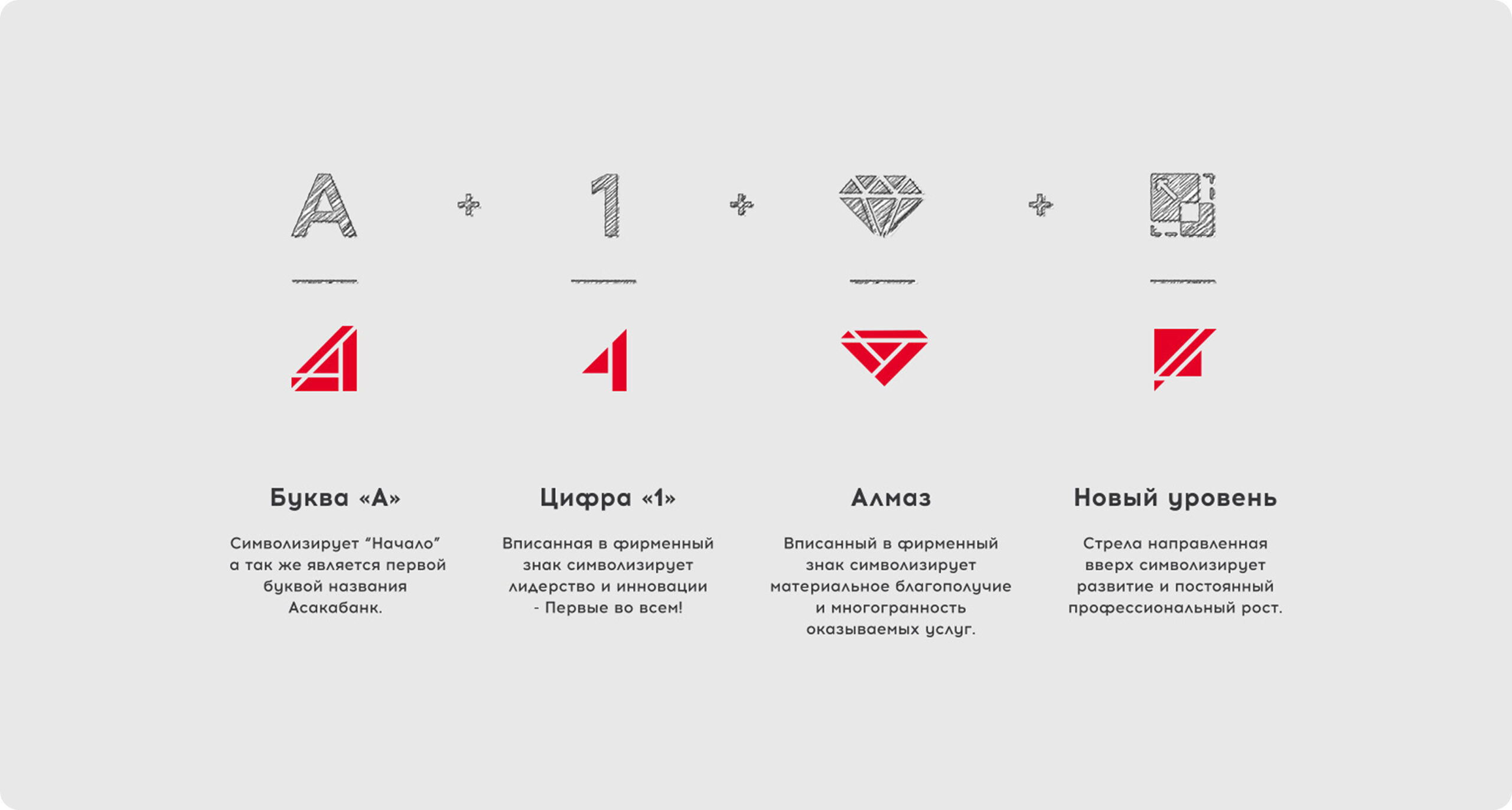
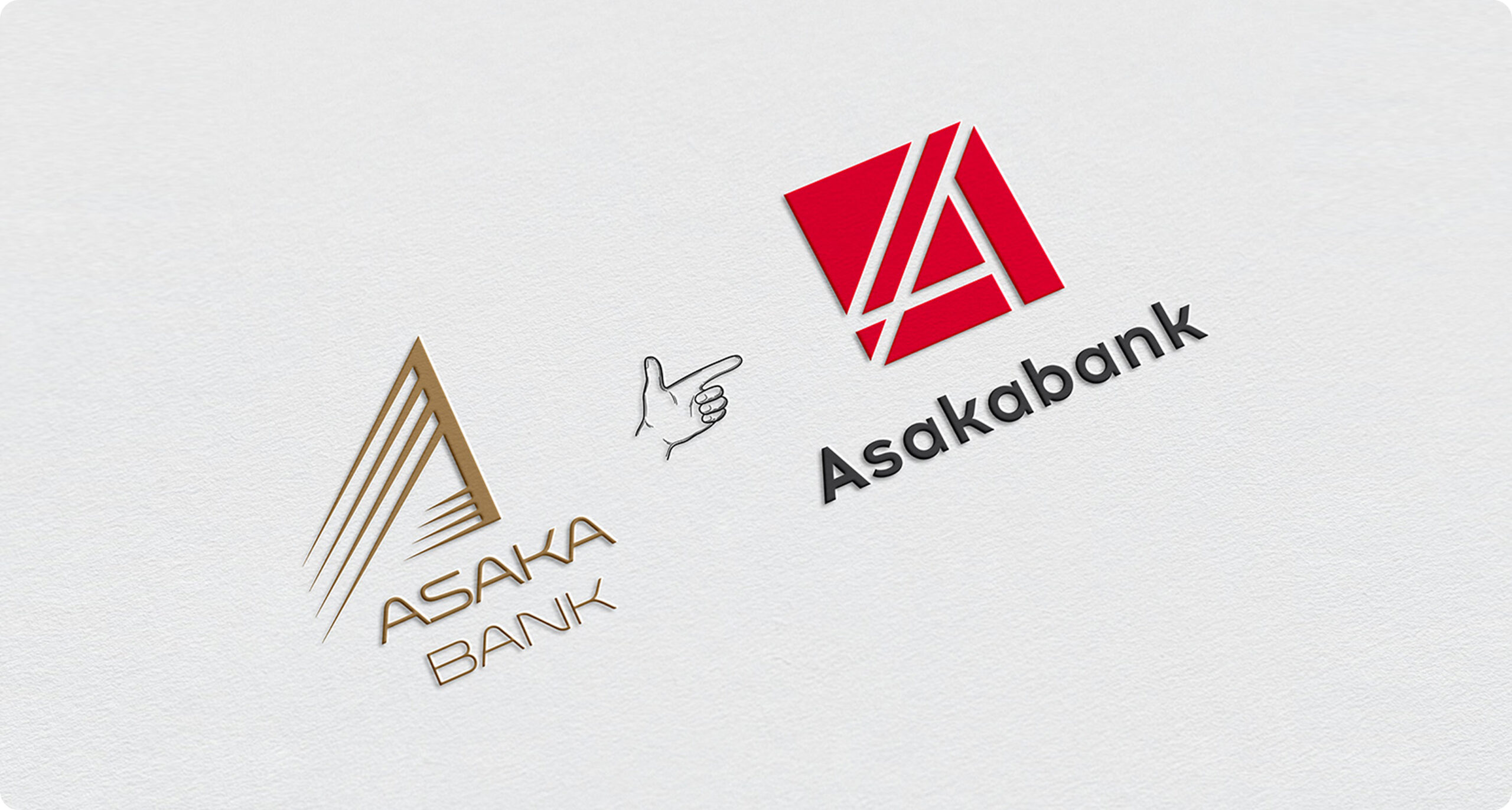
The bank’s new logo embodies several fundamental ideas. It is based on two geometric shapes:a square — symbolizing reliability, security, and discipline;a triangle — representing balance and stability. It also contains hidden meanings:the letter “A” — symbolizing a beginning and reflecting the first letter of the bank’s name;the number “1” — representing leadership and innovation;a diamond — symbolizing material prosperity and versatility;an upward-pointing arrow — representing development and continuous growth.
Описание
продукта
The rebranding of Asaka Bank is a comprehensive brand transformation reflecting the evolution of its philosophy and approach to doing business. The project goes beyond visual identity, encompassing the bank’s values, positioning, and the way it is perceived by clients and partners. The new logo, based on clear geometric forms and symbols of growth, leadership, and reliability, emphasizes the brand’s stability and innovative character. As a result, Asaka Bank moves to a new level of development while remaining close and relatable to its audience.
Процесс
разработки
The rebranding of Asaka Bank became a comprehensive project aimed at renewing the brand and strengthening its position in the market. The main goal was to create an image of the bank that reflects its history, values, and the high level of trust from its clients.
The new logo is based on geometric shapes symbolizing reliability, stability, and growth. The hidden meanings of its elements emphasize leadership, prosperity, and the bank’s commitment to continuous development.
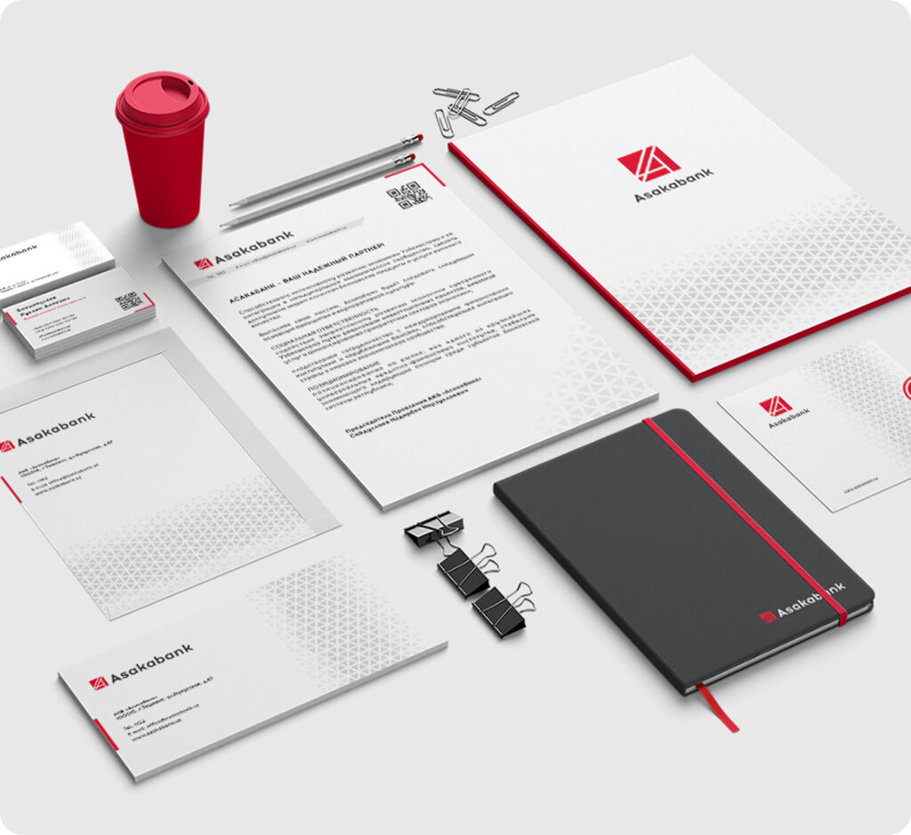
Brand Collateral Design The design of the bank’s website, advertising materials, and social media platforms was updated. The new style ensures a consistent visual identity across all brand touchpoints with the audience.
A new communication style for the bank was defined, emphasizing reliability, professionalism, and customer focus. This helps build strong and trust-based relationships with clients and partners.